PF Din Display Pro Font Family
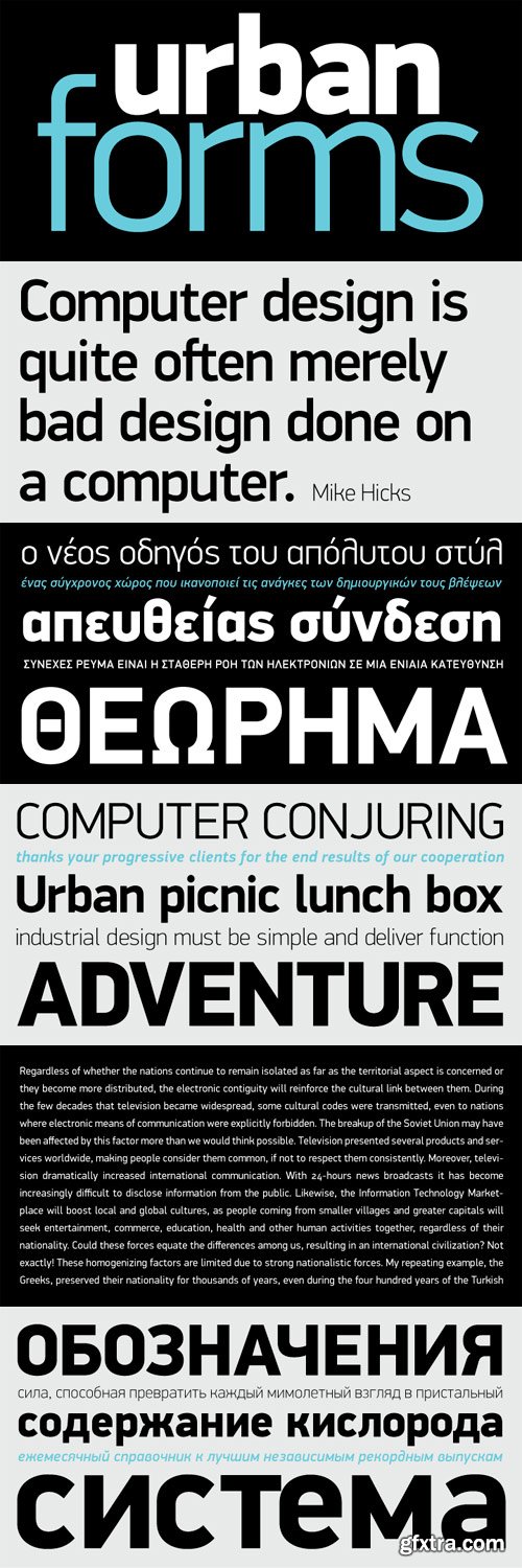
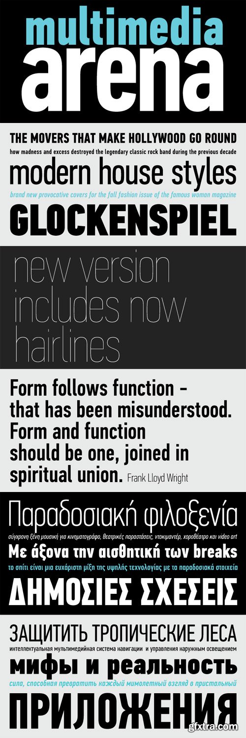
While DIN Display seems to retain DIN’s basic characteristics, it shines with its sharper corners and contemporary look. Completed in 2002, it was first released and published in Parachute’s award-winning 2003 catalog and immediately was a hit. It has been used successfully in magazines, corporate applications and packaging in fields such as music, fashion, technology, visual arts. The ‘Pro’ series has been enhanced with more weights, multilingual support and opentype features in all different styles. Specifically, this superfamily supports simultaneously Latin, Greek and Cyrillic, while each one of its 15 weights contains 1197 glyphs and 20 opentype features. Additionally, every font in this superfamily has been completed with 270 copyright-free symbols, some of which have been proposed by several international organizations. This is a set of very useful daily symbols for packaging, branding and advertising. Symbols for public areas, environment, transportation, computers, fabric care and urban life.
TTF | 14 Fonts | JPEG Preview | 6.3 Mb RAR
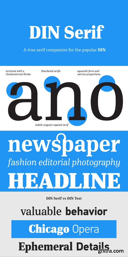
In 1936 the German Standards committee Deutsches Institut Normung (DIN) officially proposed DIN 1451 as the standard type of lettering to be used in the field of road traffic. The purpose of this standard was to lay down a style of lettering which is timeless and easily legible. Unfortunately, these early letters lacked elegance and were not properly designed for typographic applications. Ever since, several type foundries adopted the original designs for digital photocomposition. By early 2000, it became apparent that the existing DIN-based fonts did not fulfill the ever-increasing demand of complex corporate projects for more weights and support for additional languages.
Parachute® was set out to fill this gap by introducing the DIN Text series which, ever since, has become the most comprehensive and sophisticated set of DIN typefaces. It was based on the original standards but was specifically designed to fit typographic requirements. Completed in 2002, it was first released in 2003 and published in the award-winning catalog IDEA as a group of 4 separate families (original, condensed, compressed and a special display version). All families include 15 weights each, opentype features (small caps, etc) and extended support for all European languages based on Latin, Cyrillic and Greek.
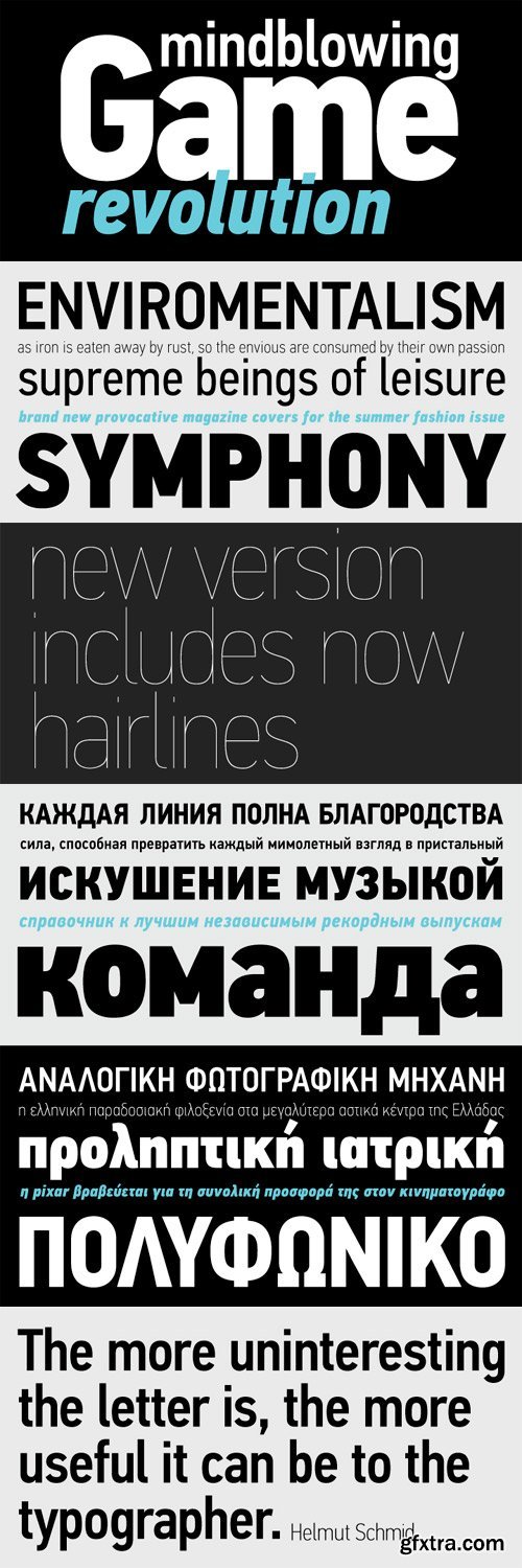
The DIN Text Pro series, has lowercase ascenders that are higher than the capitals, varying letter proportions and italics that are not a mechanically-obliqued version of the regular weights, but rather true-italics. Each weight consists of an average 1280 glyphs.
The letterforms divert from the stiff geometric structure of the original and introduce instead elements which are familiar, softer and easier to read. The other two superfamilies Condensed and Compressed share the same attributes as the original.
With its vast array of weights, the extended language support, but most of all its careful and detailed design it has proved valuable to numerous design agencies for their complex corporate projects. Additionally, every font in these superfamilies has been completed with 270 copyright-free symbols, some of which have been proposed by several international organizations. This is a set of very useful daily symbols for packaging, branding and advertising. Symbols for public areas, environment, transportation, computers, fabric care and urban life.
TTF | 14 Fonts | JPEG Preview | 7.9 Mb RAR
PF Regal Display Pro Font Family
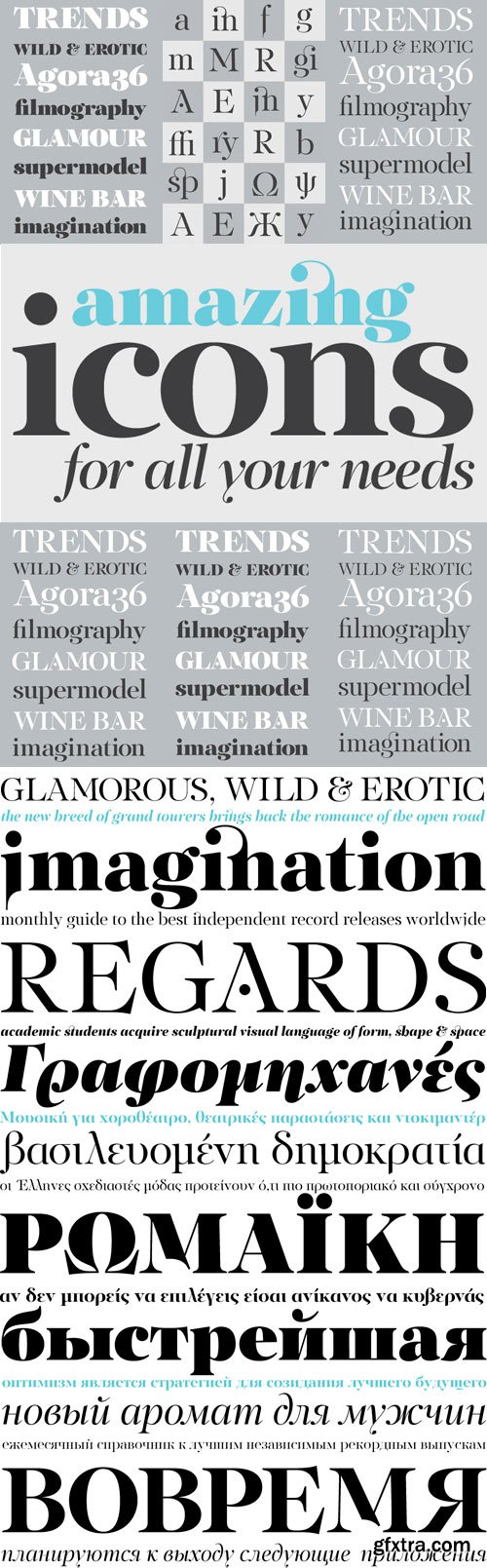
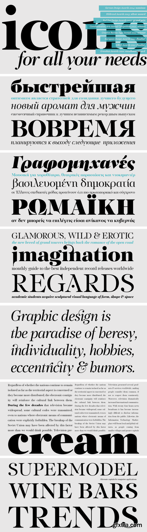
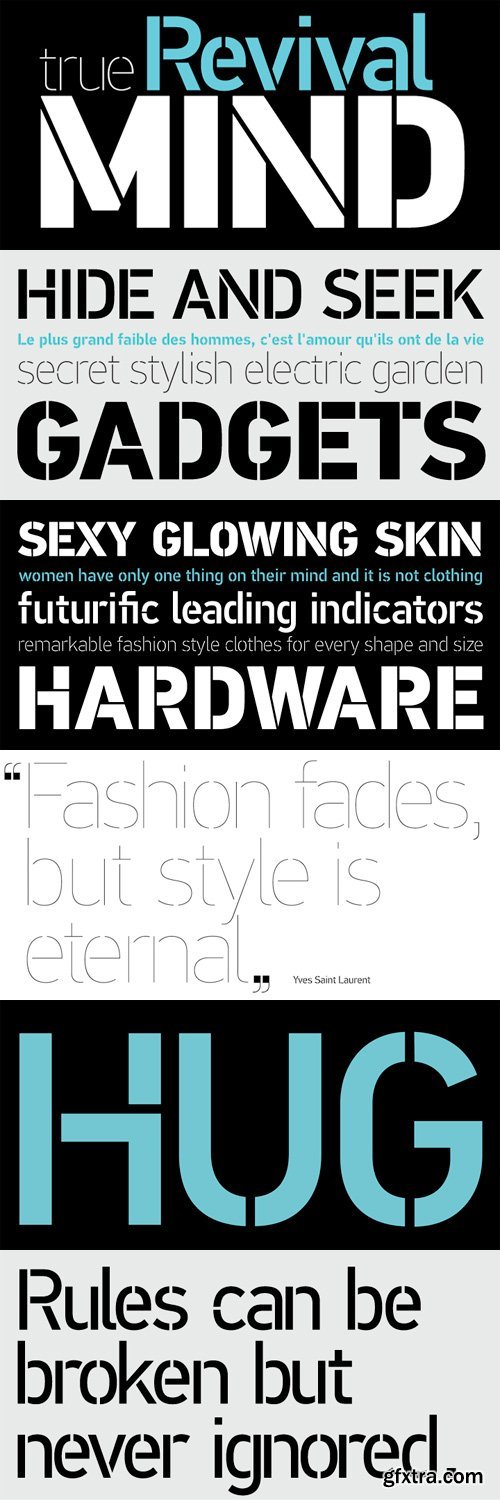
The objective of this project was to design a new typeface series for Grazia magazine. First published in 2010, Regal was later revamped and redesigned for commercial use, evolving into a type system with five related superfamilies. According to the brief, this typeface had to be elegant, luxurious, sexy, vibrant, reflect the female sensitivity and take into consideration a modern woman who is more proud, more connected, more spontaneous, open-minded and eager to try a whole host of new products and services. Targeting this consumption-wise and well-educated woman, required a typeface that is not strictly based on classic forms, but incorporates several distinct elements that express a modern woman’s personality and the products she consumes. In that respect, a whole series of 5 related superfamilies was designed, which not only emphasize femininity but also reflect both the romantic as well as the dynamic side of the female personality. For that matter, elegant curvy details were introduced in order to create a link to the female figure; teardrop terminals which reflect a woman’s sensitivity; pronounced quirks on upper and lower arms for her eyelashes; high-contrast, sharp corners at thinning terminals for her high heels; alternate glyphs for the woman who prefers to express her individuality -rather than slavishly follow trends- by using various accessories which can dramatically change her appearance; elegant endings and long curves to reflect her predisposition to dream; bell-shaped serifs with an inward rather than outward direction which recall streamlined seventies fashion. This series of typefaces is diverse in its construction as it consists of five related superfamilies i.e. text, display, finesse, swash and stencil. There is a variety of weights which range from regular to ultra black for each one of the five families. These families share common attributes but they differ in content according to each one’s usage. The whole superfamily type system is comprised of 47 weights with an average of 898 glyphs per weight. It supports simultaneously Latin, Cyrillic and Greek and comes with many alternate glyphs.
OTF | 10 Fonts | JPEG Preview | 6.5 Mb RAR
http://www.parachutefonts.com/typefaces/allfonts/regal-display-pro
The objective of this project was to design a new typeface series for Grazia magazine. First published in 2010, Regal was later revamped and redesigned for commercial use, evolving into a type system with five related superfamilies. According to the brief, this typeface had to be elegant, luxurious, sexy, vibrant, reflect the female sensitivity and take into consideration a modern woman who is more proud, more connected, more spontaneous, open-minded and eager to try a whole host of new products and services. Targeting this consumption-wise and well-educated woman, required a typeface that is not strictly based on classic forms, but incorporates several distinct elements that express a modern woman’s personality and the products she consumes. In that respect, a whole series of 5 related superfamilies was designed, which not only emphasize femininity but also reflect both the romantic as well as the dynamic side of the female personality. For that matter, elegant curvy details were introduced in order to create a link to the female figure; teardrop terminals which reflect a woman’s sensitivity; pronounced quirks on upper and lower arms for her eyelashes; high-contrast, sharp corners at thinning terminals for her high heels; alternate glyphs for the woman who prefers to express her individuality -rather than slavishly follow trends- by using various accessories which can dramatically change her appearance; elegant endings and long curves to reflect her predisposition to dream; bell-shaped serifs with an inward rather than outward direction which recall streamlined seventies fashion. This series of typefaces is diverse in its construction as it consists of five related superfamilies i.e. text, display, ?nesse, swash and stencil. There is a variety of weights which range from regular to ultra black for each one of the five families. These families share common attributes but they di?er in content according to each one’s usage. The whole superfamily type system is comprised of 47 weights with an average of 898 glyphs per weight. It supports simultaneously Latin, Cyrillic and Greek and comes with many alternate glyphs.
OTF | 10 Fonts | JPG Preview | 1 Mb RAR
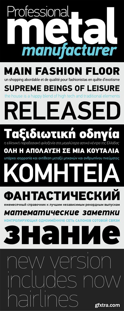
PF Din Text Compressed Pro Font Family
The DIN Text Pro series, has lowercase ascenders that are higher than the capitals, varying letter proportions and italics that are not a mechanically-obliqued version of the regular weights, but rather true-italics. Each weight consists of an average 1280 glyphs. The letterforms divert from the stiff geometric structure of the original and introduce instead elements which are familiar, softer and easier to read. The other two superfamilies Condensed and Compressed share the same attributes as the original. With its vast array of weights, the extended language support, but most of all its careful and detailed design it has proved valuable to numerous design agencies for their complex corporate projects. Additionally, every font in these superfamilies has been completed with 270 copyright-free symbols, some of which have been proposed by several international organizations. This is a set of very useful daily symbols for packaging, branding and advertising. Symbols for public areas, environment, transportation, computers, fabric care and urban life.
TTF | 14 Fonts | JPEG Preview | 6.1 Mb RAR
PF Din Text Condensed Pro Font Family
The purpose of the original DIN 1451 standard was to lay down a style of lettering which is timeless and easily legible. Unfortunately, these early letters lacked elegance and were not properly designed for typographic applications. Ever since its first publication in the 1930’s, several type foundries adopted the original designs for digital photocomposition. By early 2000, it became apparent that the existing DIN-based fonts did not fulfill the ever-increasing demand for additional weights as well as support for languages other than Latin. Parachute® was set out to fill this gap by introducing the PF DIN Text series which, ever since, has become the most comprehensive and sophisticated set of DIN typefaces. It was based on the original standards but was specifically designed to fit typographic requirements. Its letterforms divert from the stiff geometric structure of the original and introduce instead elements which are familiar, softer and easier to read. It was completed in 2002 as a group of 3 families which included condensed and compressed versions. With its vast array of weights, the extended language support, but most of all its meticulous and elaborate design, it has been proven valuable to numerous design agencies. Ever since its first release, it has been used around the world in diverse editorial, packaging, branding and advertising campaigns. It was quoted by Publish magazine as being “an overkill series for complex corporate identity projects”. The whole PF DIN Text type system includes 45 weights from Hairline to Extra Black including true-italics. Additionally, every font has been completed with 270 copyright-free symbols. In 2010 Parachute® released 4 new families DIN Monospace, DIN Stencil, DIN Text Arabic and DIN Text Universal. All these are complemented by the popular DIN Display version. Altogether the Parachute DIN series is a set of 8 superfamilies with a total of 96 weights.
TTF | 14 Fonts | JPEG Preview | 6.3 Mb RAR
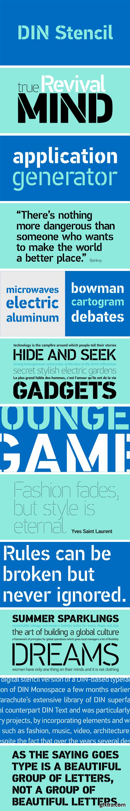
Despite the fact that over the years several designers have manually created stencil lettering based on DIN for various projects, there has never been a professional digital stencil version of a DIN-based typeface. After the successful introduction of DIN Monospace a few months earlier, PF DIN Stencil now completes Parachute’s extensive library of DIN superfamilies. It was based on its original counterpart DIN Text Pro and was particularly designed to address contemporary projects, by incorporating elements and weights which are akin to industries such as fashion, music, video, architecture, sports and communications. Traditionally, stencils have been used extensively for military equipment, goods packaging, transportation, shop signs, seed sacks and prison uniforms. In the old days, stencilled markings of ownership were printed on personal possessions, while stencilled signatures on shirts were typical of 19th century stencilling. Two companies dominated the market in the mid-twentieth century: the Marsh Stencil Machine Company in the United States and the Sächsische Metall Schablonen Fabrik in Germany. Ever since the late 1930s, it was the German Sächsische Metall Schablonen Fabrik which used heavily the new DIN 1451 standard font (introduced in 1936), attempting to overthrow the reign of the Didot-style modern roman which was at the time the most common stencil letter in Germany. These letters were manufactured mainly as individual zinc stencils which could be ordered in sizes between 10 and 100mm. The DIN Stencil family manages to preserve several traditional stencil features, but introduces additional modernities which enhance its pleasing characteristics and make it an ideal choice for a large number of contemporary projects. Furthermore, the spacing attributes of the glyphs were redefined and legibility was improved by revising the shape of the letterforms. The DIN Stencil family consists of 8 diverse weights from the elegant Hairline to the muscular Black. Currently, it supports Latin, Eastern European, Turkish and Baltic.
OTF | 8 Fonts | JPEG Preview | 4.7 Mb RAR
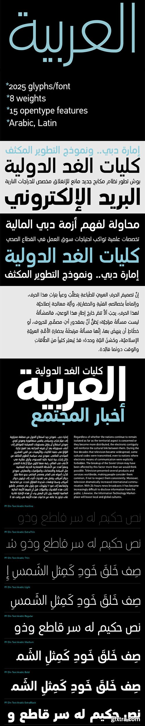
PF Din Text Arabic Font Family $895
8 OTF OpenType and WOFF Webfonts | Designers: Panos Vassiliou & Hasan Abu Afash
http://www.myfonts.com/fonts/parachute/pf-din-text-arabic/
- This Arabic typeface is one of Parachute’s most involved text typefaces. For the first time -back in 2010- a contemporary Arabic equivalent to a comprehensive DIN series of fonts was available. In fact, this set of fonts contains the most complete and powerful array of Arabic features commercially today. It comes in eight weights and includes Latin. Based on the DIN Text Pro superfamily, Parachute® released -in collaboration with designer Hasan Abu Afash- 2 new versions.
- DIN Text Arabic is the basic Arabic version which includes Latin and supports all variations of the Arabic script such as Persian, Urdu and Pashto. The second version DIN Text Universal is the most advanced DIN superfamily ever. It combines the powerful DIN Text Pro with DIN Text Arabic bringing the number of glyphs to 3320 per font. It is also enhanced with 30 advanced opentype features and kerning for all languages.
- Altogether it supports hundreds of languages, proving to be an essential tool for corporations which operate internationally. The whole family consists of eight weights from extra black to hairline. DIN Text Arabic is featured in the recent book Arabesque 2 by Gestalten.
http://www.myfonts.com/fonts/parachute/pf-din-stencil/
Despite the fact that over the years several designers have manually created stencil lettering based on DIN for various projects, there has never been a professional digital stencil version of a DIN-based typeface. After the successful introduction of DIN Monospace a few months earlier, PF DIN Stencil now completes Parachute’s extensive library of DIN superfamilies. It was based on its original counterpart DIN Text Pro and was particularly designed to address contemporary projects, by incorporating elements and weights which are akin to industries such as fashion, music, video, architecture, sports and communications. Traditionally, stencils have been used extensively for military equipment, goods packaging, transportation, shop signs, seed sacks and prison uniforms. In the old days, stencilled markings of ownership were printed on personal possessions, while stencilled signatures on shirts were typical of 19th century stencilling. Two companies dominated the market in the mid-twentieth century: the Marsh Stencil Machine Company in the United States and the Sächsische Metall Schablonen Fabrik in Germany. Ever since the late 1930s, it was the German Sächsische Metall Schablonen Fabrik which used heavily the new DIN 1451 standard font (introduced in 1936), attempting to overthrow the reign of the Didot-style modern roman which was at the time the most common stencil letter in Germany. These letters were manufactured mainly as individual zinc stencils which could be ordered in sizes between 10 and 100mm. The DIN Stencil family manages to preserve several traditional stencil features, but introduces additional modernities which enhance its pleasing characteristics and make it an ideal choice for a large number of contemporary projects. Furthermore, the spacing attributes of the glyphs were redefined and legibility was improved by revising the shape of the letterforms. The DIN Stencil family consists of 8 diverse weights from the elegant Hairline to the muscular Black. Currently, it supports Latin, Eastern European, Turkish and Baltic.
OTF | 8 Fonts | JPG Preview | 1.7 Mb RAR
SermonBox - Seasonal Collection

SermonBox - The Series Pack Collection

Top Rated News


Would you like to be a Author?


